| Handle Graphics 5.2 GUI Features | Search Help Desk |
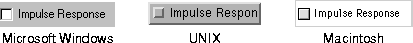
characters value for the Units property for Uicontrol, Root, Figure, and Axes objects. Using this property value enables you to define the location and size of objects in units that are based on the size of the default system font:
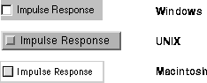
h = uicontrol('Style','checkbox','String','Impulse Response',...
              'Units','characters','Position',[5 5 23 1.7]);
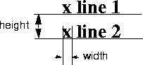
The width of a control includes its border, the area required for the string, and, for check boxes and radio buttons, additional space for the selection graphic. As a result, you need to add padding characters to provide enough space to display the string and make it readable. The table below provides guidelines for the number of padding characters for different types of controls. You may need to adjust the padding depending on the width of the characters in the String property value.| Control |
Padding of Width |
Padding of Height |
| Check box |
7 |
.7 |
| Edit text |
5 |
.7 |
| List box |
5 |
.7 |
| Popup menu |
7 |
.7 |
| Push button |
4 |
.7 |
| Radio button |
7 |
.7 |
| Static text |
4 |
0 |
characters property value:
pblabel1 = 'Apply';
pblabel2 = 'Revert';
pblabel3 = 'Close';
lenlabel = max(length(pblabel1, pblabel2, pblabel3)) + 7;
Then, when you define the three push buttons, use
lenlabel as the third element in each position vector.
You can also define the position of Axes and Figure objects in character units to define the layout of the entire GUI based on the size of the default system font.
A tooltip is a small rectangle that contains textual information. A tooltip is associated with a Uicontrol and appears below the control when the cursor is held over the control for a certain amount of time (determined by system settings).
To associate a tooltip with a control, define a text value for the TooltipString property:
TooltipString property.
TooltipString property.
TooltipString property.
To display a tooltip, position the mouse pointer over a control and leave it there. If a tooltip is defined for the object, it appears after a short amount of time (the exact amount of time is determined by system settings).
For example, this figure shows a tooltip for a Close push button on a Macintosh: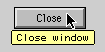
cb = uicontrol('Style','pushbutton','String','Close',...
     'TooltipString','Close window');
MATLAB 5.2 provides a new Uicontrol object called a toggle button. Toggle buttons have two states, down (selected) and up (unselected). When you click on a toggle button, its state changes and its callback is executed.
Toggle buttons are similar to push buttons except that they retain their state until changed. When you click on a toggle button, these things occur:
Value property to change. If the state goes from unselected to selected, Value changes from Min to Max. If the state goes from selected to unselected, Value changes from Max to Min.
Max property specifies the value when the state is down, or selected; its default value is 1. The Min property specifies the value when the state is up, or unselected; its default value is 0. The current state is stored in the Value property; its default value is 0, so the starting state of a toggle button is unselected.
These statements create a toggle button and define its callback, which displays a message that indicates the toggle button state.
% Define the toggle button callback
cb = ['if get(tb,''Value'') == 1, disp(''Selected''),',...
      'elseif get(tb,''Value'') == 0, disp (''Unselected''),',...
      'endif'];
% Define the toggle button
tb = uicontrol('Style','togglebutton','Callback',cb);
This example changes the selection state of the control:
% This statement makes the toggle button appear selected
% It also causes the callback to execute
set(tb, 'Value', get(tb, 'Max'))
Displaying Truecolor Images on Controls
MATLAB 5.2 supports the ability to display images on push buttons and toggle buttons. To create a push button with an image, set theCData property to be a truecolor image, an m-by-n-by-3 array containing RGB values. Each value must be within the range 0.0 to 1.0.
For example, this command creates a push button on which is displayed the image defined by the array my_image:
uicontrol('Style', 'pushbutton', 'Position', [100 100 75 30],...
   'CData', my_image);
A context menu is a menu that is attached to an object and is activated by a right-button click on a Microsoft Windows or UNIX system. On the Macintosh, you perform a right-click by holding down the Ctrl key and clicking the mouse button. This action is called an extend-click.
For example, this figure shows a simple plotted line. When you right-click anywhere on the line, a context menu appears, providing three choices. Selecting a menu item from the context menu executes a callback that changes the line style.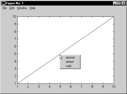
uicontextmenu function. For example, this statement creates a context menu and assigns its handle to cm:
cm = uicontextmenu;You can specify the
Callback and Visible properties.
The Callback property specifies the callback routine for the context menu (not for the individual menu items). The callback routine is called immediately after the right-click but before the context menu becomes visible. Defining a callback routine for a context menu gives you the opportunity to modify the menu's contents before it appears. A callback routine for a context menu might be useful when the context menu items depend on the state of the application when the context menu is invoked. The default value for the Callback property is ''.
The Visible property determines or indicates whether the context menu is posted. The property is normally controlled automatically, returning 'on' when the menu is posted as a result of a right-click and 'off' after a menu item has been selected and the context menu is withdrawn. You can use the property to force the context menu to be posted without a menu click or to be withdrawn before an item is selected.
The Uicontextmenu object is a child of the Figure and the parent of the Uimenu objects that define its contents.
You define context menu items using the uimenu function:
uimenu(handle, 'Label', 'string', 'Callback', value)Each
uimenu statement adds one menu item to the context menu identified by handle. The order of the menu items is the same as the order of the uimenu statements. These statements add menu items to the context menu shown in the example above and define their callbacks:
% Define context menu
cm = uicontextmenu;
% Define context menu item callbacks
cb1 = ['set(hline,''LineStyle'',''--'')'];
cb2 = ['set(hline,''LineStyle'','':'')'];
cb3 = ['set(hline,''LineStyle'',''-'')'];
% Define context menu items
item1 = uimenu(cm, 'Label', 'dashed', 'Callback', cb1);
item2 = uimenu(cm, 'Label', 'dotted', 'Callback', cb2);
item3 = uimenu(cm, 'Label', 'solid', 'Callback', cb3);
Associating the Context Menu with an Object
To associate a context menu with an object, the statement that creates the object must reference the context menu using the newUIContextMenu property. The form of the property name/property value pair is
'UIContextMenu', object_handle
In the example above, these statements create the line object and associate it with a context menu, whose handle is cm:
hline = plot(1:10); set(hline, 'UIContextMenu', cm)When you extend-click in a Figure, these steps are performed:
CurrentPoint is set to the point on which the button down action
occurred.
SelectionType is set to extended.
CurrentObject is set to the object found during the hit test (step 1).
WindowButtonDownFcn callback is executed, then the current
object's ButtonDownFcn is executed. If the current object is not associated
with an enabled context menu, none of the following steps are performed.
CallbackObject is set to the Uicontextmenu displayed. (?)
WindowButtonUpFcn callback is executed.